Gone are the days when only desktops were the key players for internet browsing. Today, Mobile phones and tablets have taken over the world. This is the age of smartphones where internet browsing is majorly done through smartphones and not just desktops PCs which alarms you to be sure that your web design should be responsive.
So, What does it mean by a ‘responsive web design’?
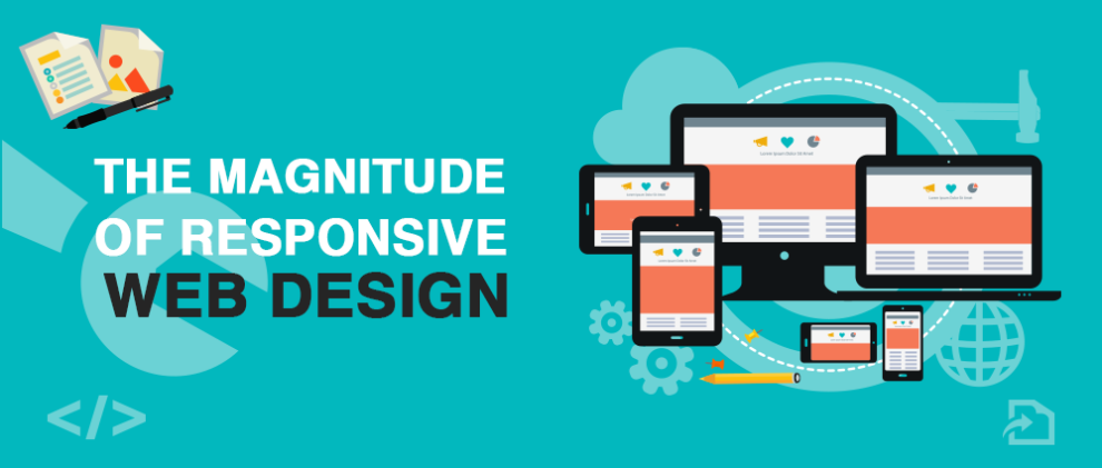
A responsive web design is that which fits itself to any size of the screen and perform functions accordingly. The objective behind a responsive site is to have a site which changes itself accordingly when viewed on smart devices of various sizes.
With the increase in number of smart phone users, if you think you can survive without a responsive design, you are just fooling yourself.
Below are various reasons which explain the magnitude of a responsive web design.
- Boom in Mobile Usage
The generation of millennials and post-millennials are consumed in the usage of smart devices. And why shouldn’t they? Smartphones have brought great convenience. You can check your emails during class, check social networks while standing in the long cue of grocery checkout and search anything anywhere.
Previously, many sites had different versions for different devices. One strictly for desktop users while other for mobile users, which become very frustrating. But now, you can have just one responsive site which is set to work on any device.
So, a responsive web design is an integral portion in building a user-friendly mobile web experience.
- Effective SEO
If we talk about Google Indexing, Responsive web designs pay a huge part in bringing value to SEO.
Since you have just one web page, it becomes easy for Google to gather data about your page. The chances of SEO error are also minimalized. Also, more hits are received by responsive websites which deliver authority as well as quality to your audience.
So, if you have a responsive website, you will save money, preserve time. Also, convert and retain more clients. There is a great possibility of the high ranking in SERPs as well.
- Un-interrupted User-Experience
Responsive website development provides a seamless user experience which is so far its biggest benefit whereas the unresponsive web will disfigure your websites on different devices where you may have a perfect view of the website on desktops but not on other devices. For example, text will be shuffled, images will not align even the users will have to scroll a number of pages if they want to search any particular information. Even, many websites are converting into responsive view there is some website that gives more weightage to design as compare to UX. These factors bring troubles for the users and hence they look for other sites. Therefore, in order to avoid this situation, one must analyze the quality of web design.
- Low Cost Benefits
Because you will have just one site to maintain instead of two, it will automatically minimize the maintenance cost. However, initially, it is comparatively expensive. Apart from that, it takes little setup time, and it is easy to maintain and offers tailored location-based traffic. And since your time has been saved, you can invest it in other important areas of your business.
- Screen size adaptations
Another reason to promote responsive web design is its screen size adaptability. With such a feature, you can cater to any new devices which are introduced every day with which users are facilitating themselves.
Final thoughts
Responsive web designs make sure that your site displays rightly on each platform. It will automatically adjust itself to suit each screen size and will bring more hits to your website. Without having a responsive web design, your business has huge chances of suffering. Thence, getting your website redesigned to be responsive from a reputed web design & development company will lead to better placement on search engines, improved UX and increase conversions.